THE CLIENT
Thrive is an organically sourced CBD product company that helps improve health, decrease anxiety, and manage daily stress better.
THE KEYWORDS
Confident / Classy / Affirmative / Minimal
THE SOLUTION
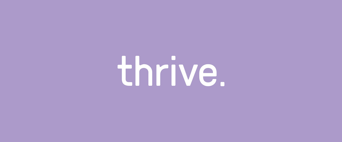
The main idea of the founders was to create classy, minimal and, at the same time, affirmative branding for their products. That’s why we decided to go with a Sans Serif font type with soft edges and put a dot at the end of the logo for a stronger affirmative feel.
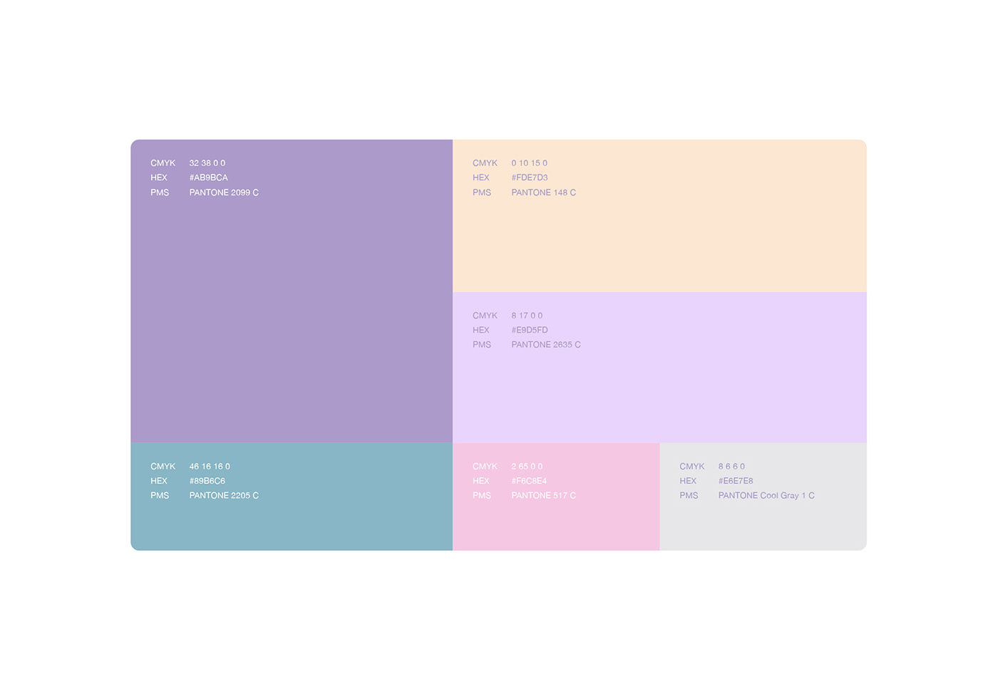
To create a friendly look, we selected soft pastel colors, which have an association with care, love, and trust.
For a simple and minimal look, we created a matte bottle out of a purple pastel background with only the logo on it. The matte surface adds a prestige feel to the product and the design itself just says it all, “Thrive”, no more words or explanations needed.
The product and shipping boxes are as simple as the product bottle itself, consisting of the main brand color, which is purple pastel. For the shipping box, we have included a slogan that says it all.